
Image © 2023 Jim Hobart macbethstudio.com
As a professional retoucher, I always work from a punch list. There are a often things to polish, donor plates to composite, concessions that were made during the shoot to address (fix it in post), product colors to match, the list goes on…
There is always a detailed conversation with the creative team, usually accompanied by notes and elaborate diagrams, mood boards and the like.
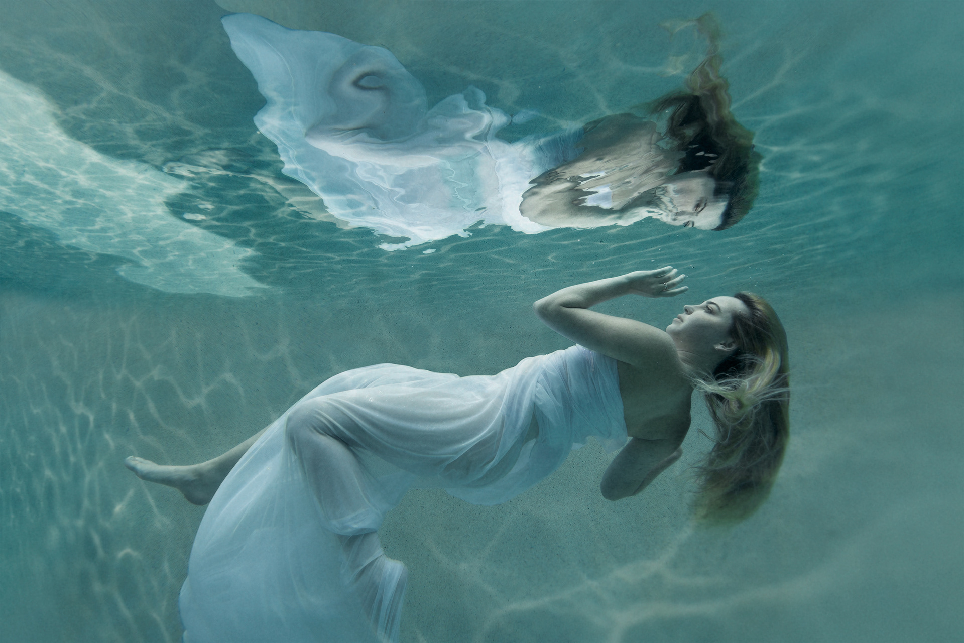
On this assignment my client came to me with a personal project; a stunning image of her daughter taken by Orlando photographer Jim Hobart, and gave me a simple directive: “Just do your thing!”
Wait - what? No client ever says that. I am forever matching styles, keeping a look within brand guidelines… No script?
This was going to be fun!
My client on this project Almut Belote is a Master Goldsmith and designer of bespoke jewelry. Almut and I have worked together for a number of years on many advertising projects for her company, and from our previous work together and her stunning jewelry, I knew that the aesthetic bar would be a high one.
My process is pretty straightforward, I start out with a basic image processing, simple cleanup of visual distractions, (such as the pool tile & stairs), then polish the things that are already working, composing in additional frames like the light refraction patterns, and then once the structural elements are set, move on to shaping the look.
Side Note: I always need to edit in a nondestructive fashion, which means having the ability to reverse course at any point. This can make for rather large and complicated Photoshop files, but it’s not unusual for a creative team to want to back-up two revision cycles and push a project in slightly different direction, so flexibility must be maintained.
At this stage, I get to put my art director’s cap on and start to really have fun. Dial-in the contrast, add drama and depth, (literally in this case). Push around the color and tonal values to create an ethereal feel. Lowering the clarity to make it feel more like a live body of water. This last step was a product of experimentation and as soon as I moved that slider, I knew I was on to something. It instantly gave the image a more painterly quality. YES!
At this stage, I get to put my art director’s cap on and start to really have fun. Dial-in the contrast, add drama and depth, (literally in this case). Push around the color and tonal values to create an ethereal feel. Lowering the clarity to make it feel more like a live body of water. This last step was a product of experimentation and as soon as I moved that slider, I knew I was on to something. It instantly gave the image a more painterly quality. YES!
During this type of experimentation, I often try three or four quick variations when developing a look. Even if I feel like I nailed it on the first try, I like getting a few more variations on the theme. All of this experimenting is done in a single Photoshop document and I “save” the different variations as Layer Comps (which works a bit like key-framing in animation) and then I take a break. The break is crucial to my creative process. I either move on to another image or literally walk away for a short break. When I return with "fresh eyes" it’s always easier to decide what is working and what is not. Everyone on the team was in agreement, one option was the clear choice.
My client was beyond delighted and had this image printed ultra-large format for her home.
So, what can I elevate for you?
Let’s talk.