Techniques: Compositing, Retouching, Color Grading
For this project, we partnered with the multi-talented Photographer/ Director Ben Van Hook, plus the creative minds at &Barr Agency for a hard-hitting campaign highlighting the impactful work being done by Habitat for Humanity in the Greater Orlando Area.
What really set this project apart for me is that our subjects are real people with real stories, not actors or models, and this authenticity shines through in the work.
Elevating already great work starts with removing distractions and enhancing inherent strengths. It's a distillation process where we amplify what is resonating and mute the elements that distract. Next steps involve color and tonal enhancements which help to shape the mood and emotional feel of the images. This step is a subjective and personal part of the creative process, though shaping the “look" is always the last step to enable the flexibility to pivot without restricting options in post.
It's not every day that we get to create visuals that not only tell a compelling story, but also help bring about positive change. This successful campaign was recently honored with a Gold Award in the prestigious Graphis Magazine. The recognition is a cherry on top of an already rewarding project and reflects the dedication and creativity of the entire team.
All images © 2023 Ben Van Hook Pictures. No unauthorized use without written permission.
All images © 2023 Ben Van Hook Pictures. No unauthorized use without written permission.
All images © 2023 Ben Van Hook Pictures. No unauthorized use without written permission.
All images © 2023 Ben Van Hook Pictures. No unauthorized use without written permission.
All images © 2023 Ben Van Hook Pictures. No unauthorized use without written permission.
Acknowledgements:
Photographer - Ben Van Hook
Agency &Barr
Creative Director - Christian Wojciechowski
Art Direction - Christian Wojciechowski and Rachel Clements
Copywriter - Megan Rosenoff
More about this project from & Barr:
Assignment
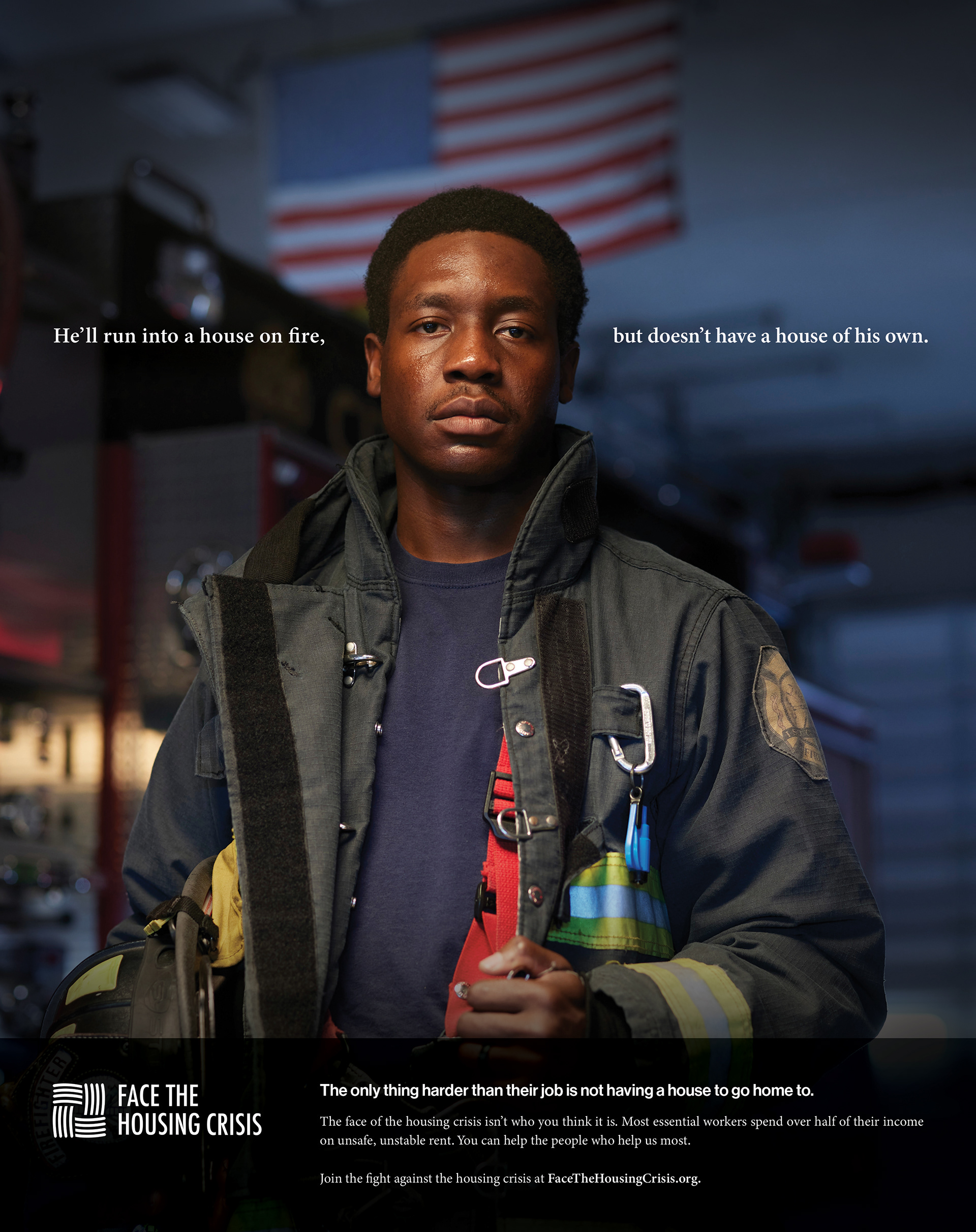
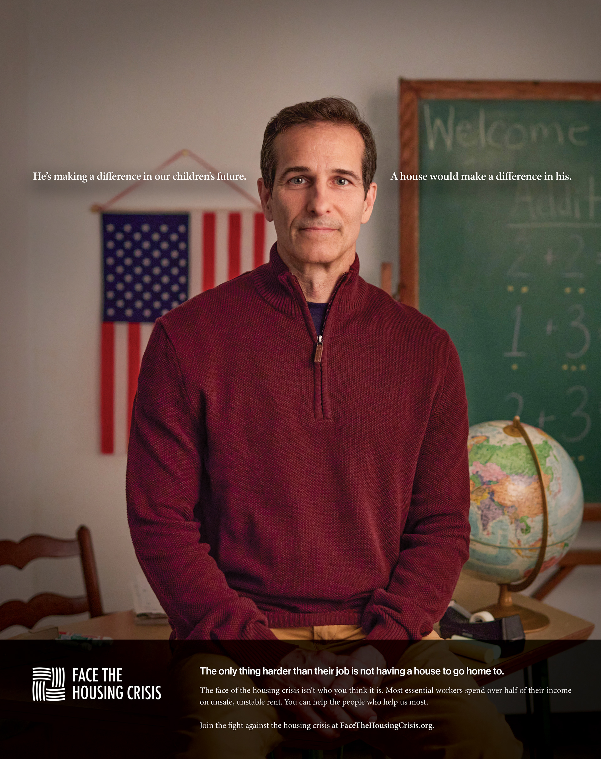
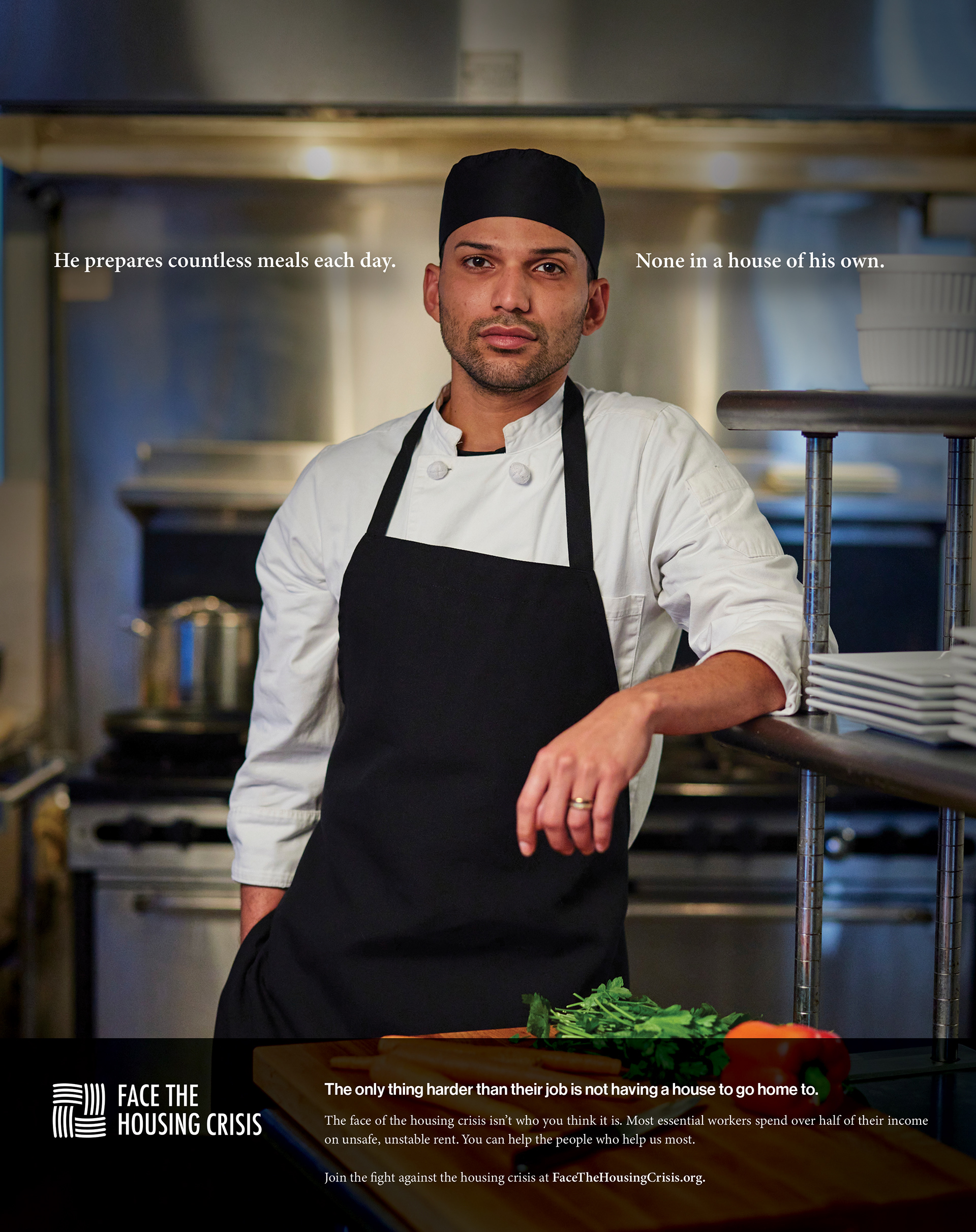
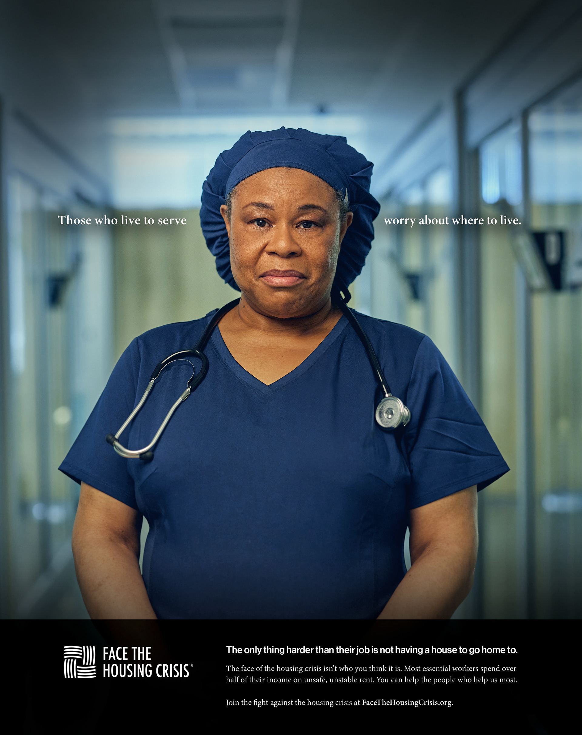
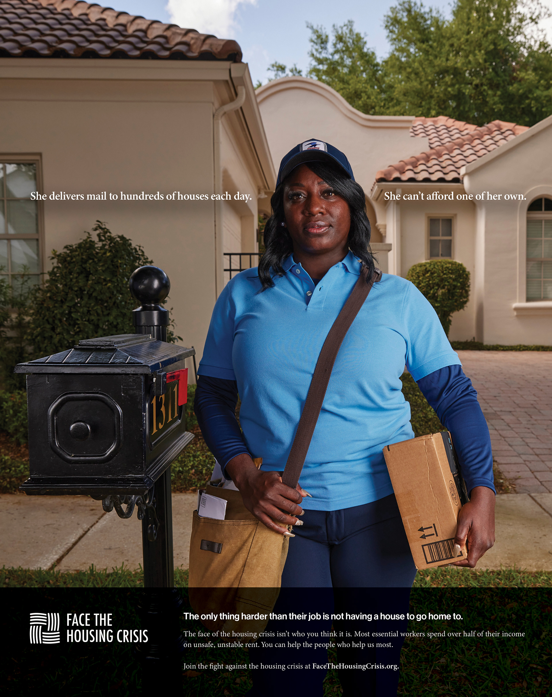
The client’s assignment was simple: grow awareness of HAB vision and educate consumers what the brand does. But After meticulous and careful research, we came to the conclusion that Habitat For Humanity’s challenge lies not in being unnoticed, but rather in being misunderstood. Many people hold the misconception that Habitat simply hands out homes to those in need without any effort on the recipients' part. However, this perception couldn't be further from reality. This is where our campaign comes into play, as we shifted our objective to proving that the face of the housing crisis isn’t always who you think it is. Habitat is dedicated to aiding some of the most hardworking members of our community, helping them transition from unstable rental accommodations to becoming homeowners with their own mortgages. These are the individuals you wouldn't typically associate with needing housing assistance, yet they are integral to our community. Challenging assumptions is crucial.
Approach
Our campaign is strategically designed to resonate with our audience by leaning heavily into two insights that drove our creative approach. The first being that 9 out of 10 essential workers, including EMTs and teachers, lack the income to afford a one-bedroom rental; and second, the COVID era strengthened people's emotional connection with essential workers, fostering a desire to give back and support them. Creatively, the campaign is to-the-point and hard-hitting. A social issue like this demands honesty and a human face. Each portrait features real professionals in their field. Their stories are real, and their faces tell us about not just struggle, but hope. But the true impact hits when you learn that each professional is also a real Habitat homeowner. This wasn’t a campaign for actors, and the portraits speak for themselves. Notice that when you read the headline, you make eye contact with the human on the screen. Breaking the headline on either side of the subject’s head forces the reader to look at the human being in the portrait. Nothing shows the true soul of a person like their eyes, and forcing the eyes of the reader to look into the eyes of our hardworking professionals adds a sense of profound gravitas. The copy isn’t shy, and dares to be bold enough to create a moment of pause for the reader. This project became bigger than simply an ad campaign right before our eyes. It became a movement, an initiative bigger than any one brand. Spearheaded and funded by Habitat For Humanity, it became a shared mission of any social commentator or nonprofit that wanted to be a part of it. Therefore, we created a campaign logo mark inspired by a Gordian Knot—a historical symbol representing an intricate and profound problem. Without the hands of many, it would remain a tangled knot that might never be solved. The logo evokes the look of hands crossing over each other, symbolizing that only together, will we solve this problem.
Results
The campaign is currently being used within the state and national political spheres to put a “face” to the crisis. You can also find the campaign on CTV/OTT, OOH, print and social. It’s been picked up by state and national politicians, and is being used to create deep conversations on the social issues that are affecting every single one of us in our community. Data-wise, so far we've driven 4.3m impressions and 36.6k clicks to the website. But it won’t be the data or ROI that matters most. Because this campaign was always about changing the world, but it starts with changing people’s minds.